GOOD DAY BOX CASE STUDY
Good Day Box provides a healthy lunch alternative for people on the go. They sell boxed lunches made with whole foods and organic ingredients. Unhappy with their identity at the time, the company decided it was time to rebrand.

They had an idea of the direction they wanted to go in but were having issues finding a designer that could properly articulate their vision. The original logo was created internally but they felt they needed to hire a professional that could raise the bar and give their brand the look it needed to attract the right customers.
After several rounds of revisions with a freelancer and were not getting the results they wanted. This issue was costing them time that could have been better spent on another aspect of their business and it was also costing them money in the form of paying designers for work that was missing the mark.
I needed someone that was more creative and could give me something original and unique to the vision I have for my brand.
We sat down with the owner Amber Hunter and got a sense of the brand’s purpose, vision and direction.
It became very clear that the brand was about supporting hard working people throughout the day by helping them maintain their need for balance and sustainability through healthy whole and organic food.
After going through our collaborative process of strategy, and identity development, we settled on a mark that reflected the brand’s strong desire to create balance in people’s lives.
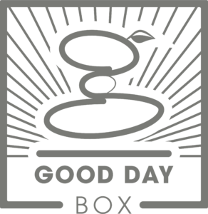
The closed loop “g” is based on the meditative practice of balancing stones which we are using as a metaphor for harmony and balance in life.
The lines that radiate from the “g” refer to the idea of sun rays which many people associate with a “good day”.


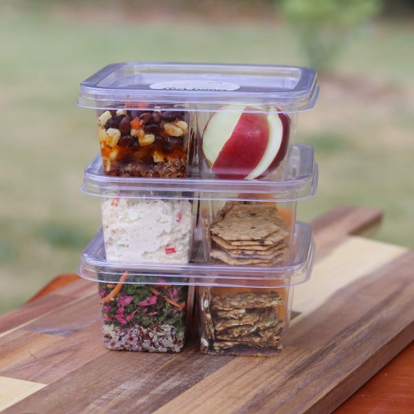
These elements coupled with a vibrant color pallet and lifestyle photography which speaks to our desire as people to “put in the work to achieve your dreams” or have a fun day with our family and friends” give the Good Day Box brand a thoughtful
and established feel.
Good Day Box now has the look that it needs to confidently go into the marketplace. They now have a unique identity that speaks to their audience and allows for brand recognition. They now have direction and can clearly focus on marketing their brand to their specific target audience.
GOOD DAY BOX CASE STUDY
Good Day Box provides a healthy lunch alternative for people on the go. They sell boxed lunches made with whole foods and organic ingredients. Unhappy with their identity at the time, the company decided it was time to rebrand.
They had an idea of the direction they wanted to go in but were having issues finding a designer that could properly articulate their vision. The original logo was created internally but they felt they needed to hire a professional that could raise the bar and give their brand the look it needed to attract the right customers.
After several rounds of revisions with a freelancer and were not getting the results they wanted. This issue was costing them time that could have been better spent on another aspect of their business and it was also costing them money in the form of paying designers for work that was missing the mark.
I needed someone that was more creative and could give me something original and unique to the vision I have for my brand.

We sat down with the owner Amber Hunter and got a sense of the brand’s purpose, vision and direction.
It became very clear that the brand was about supporting hard working people throughout the day by helping them maintain their need for balance and sustainability through healthy whole and organic food.
After going through our collaborative process of strategy, and identity development, we settled on a mark that reflected the brand’s strong desire to create balance in people’s lives.

The closed loop “g” is based on the meditative practice of balancing stones which we are using as a metaphor for harmony and balance in life.
The lines that radiate from the “g” refer to the idea of sun rays which many people associate with a “good day”.


These elements coupled with a vibrant color pallet and lifestyle photography which speaks to our desire as people to “put in the work to achieve your dreams” or have a fun day with our family and friends” give the Good Day Box brand a thoughtful
and established feel.
Good Day Box now has the look that it needs to confidently go into the marketplace. They now have a unique identity that speaks to their audience and allows for brand recognition. They now have direction and can clearly focus on marketing their brand to their specific target audience.
